MOTO DISPLAy
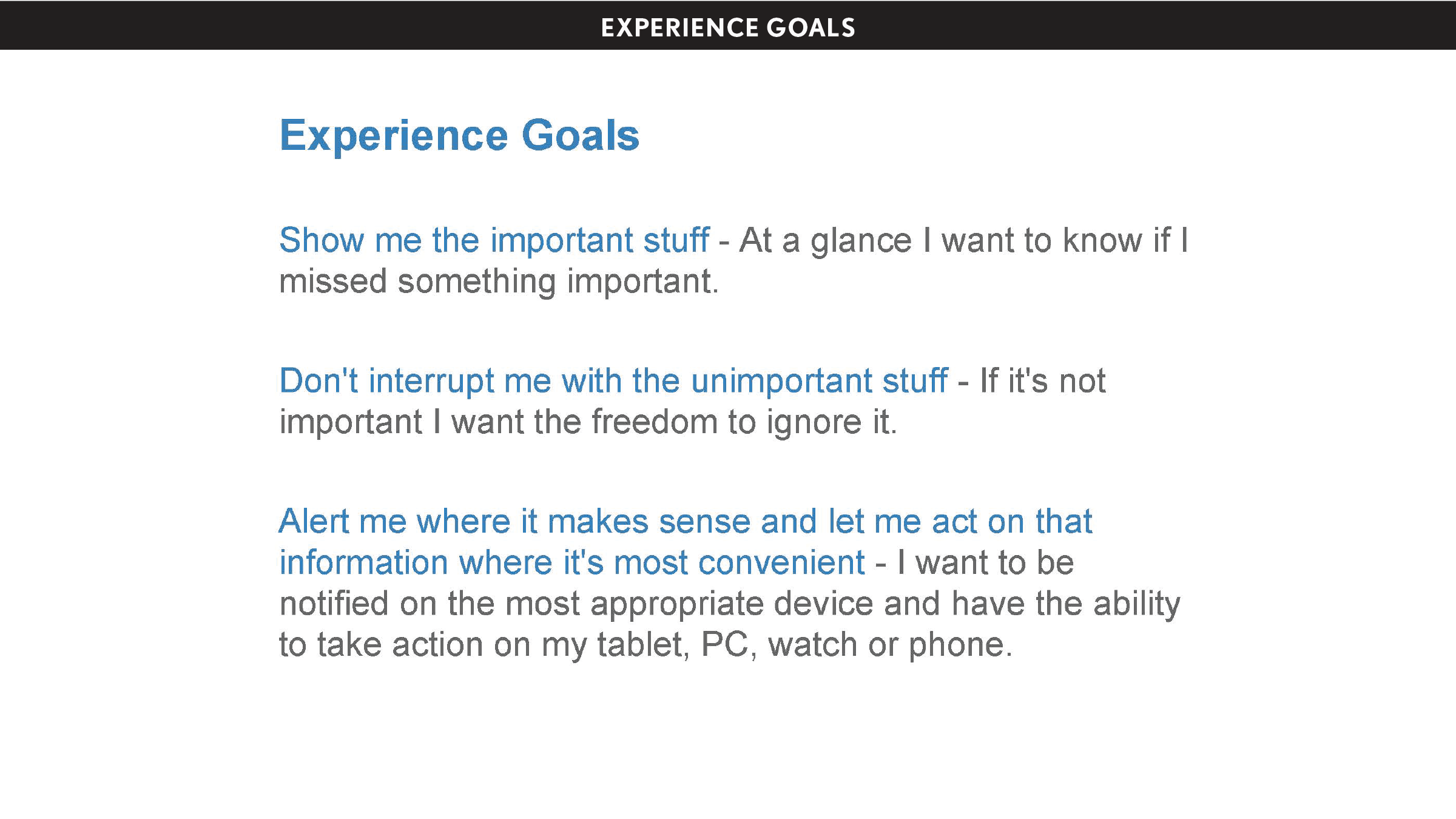
People can engage with their world and trust they'll get important info at a glance when they need it.
Emerging technology solves a user problem
Moto Display, which launched on the original Moto X in 2013, is a signature Moto feature that resulted from advanced display technologies solving a user problem—notification anxiety.
In 2012, Motorola's display engineers developed a system that would allow a phone's screen to show information on an AMOLED display without keeping the device's processor running and draining battery, essentially creating what we called an "Always On Display." The technology opened a world of opportunity. But what should such technology do for the user?
At the same time, our consumer design team at Motorola had been exploring hardware concepts to improve the notification experience on smartphones, which we believed could be better. Back then, when your phone was sleeping, new notifications only appeared via a tiny blinking light—sometimes showing color. It was mostly a binary experience. Instead of improving the device's lighting system, what if the whole display could show notification information while the device was sleeping, without draining the battery? How would you design such an interface? These engineering and design teams came together to answer that question.
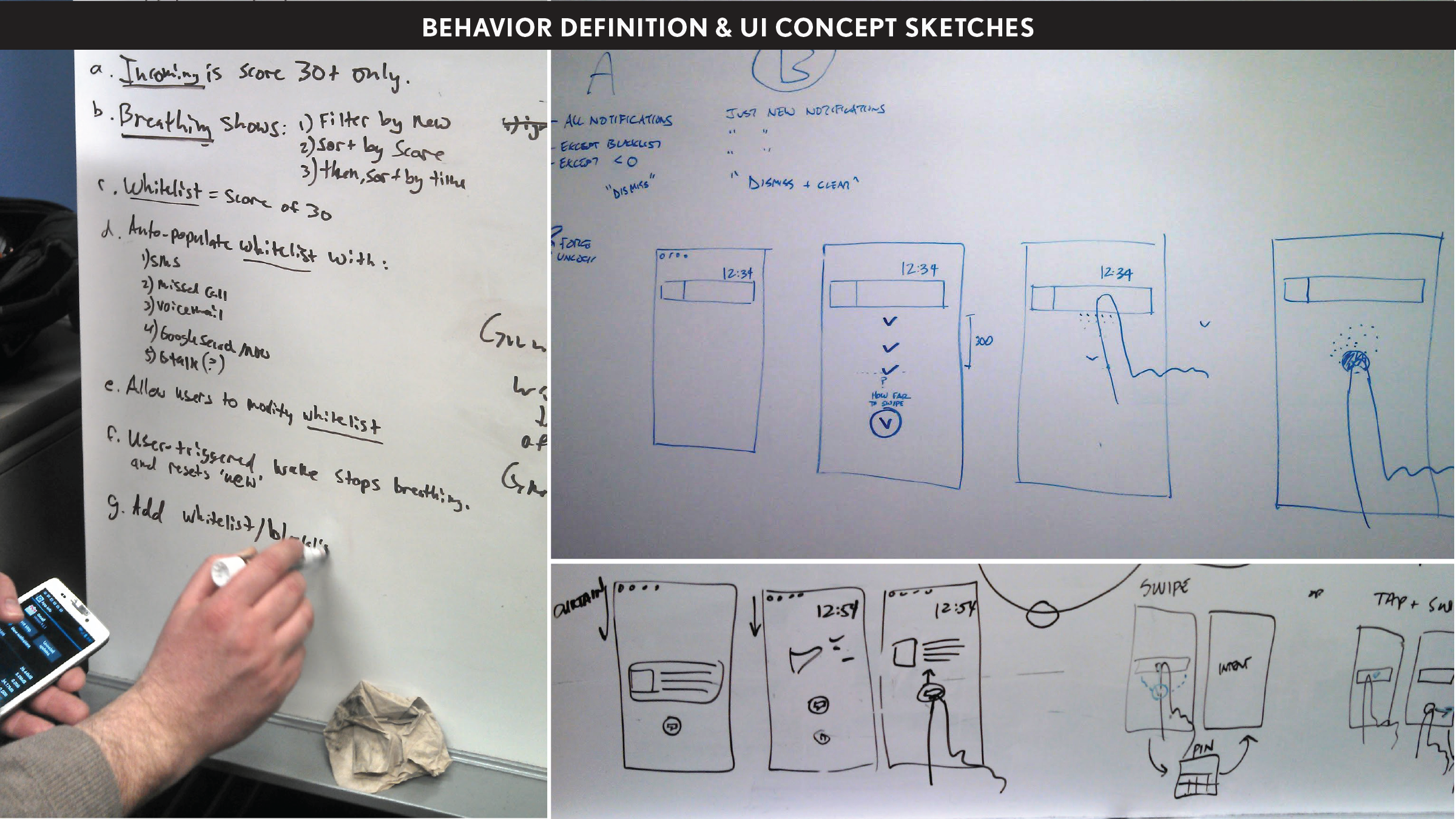
Research showed that people woke their phones 160 times a day just to see the time or check notifications. To truly improve the user's experience while their phone was "off," the challenge was to create something that would be ambient and subtle enough that it could disappear into the background while also giving the user enough information to help them decide whether or not to unlock and interact with their phone. We embraced an opportunity to design more than a notification experience, but to create a new kind of device that freed people to be present in the real world. We sought to help people stay informed about device activity, peripherally, without disappearing into their phones to check the time or see if they got that email they were expecting.
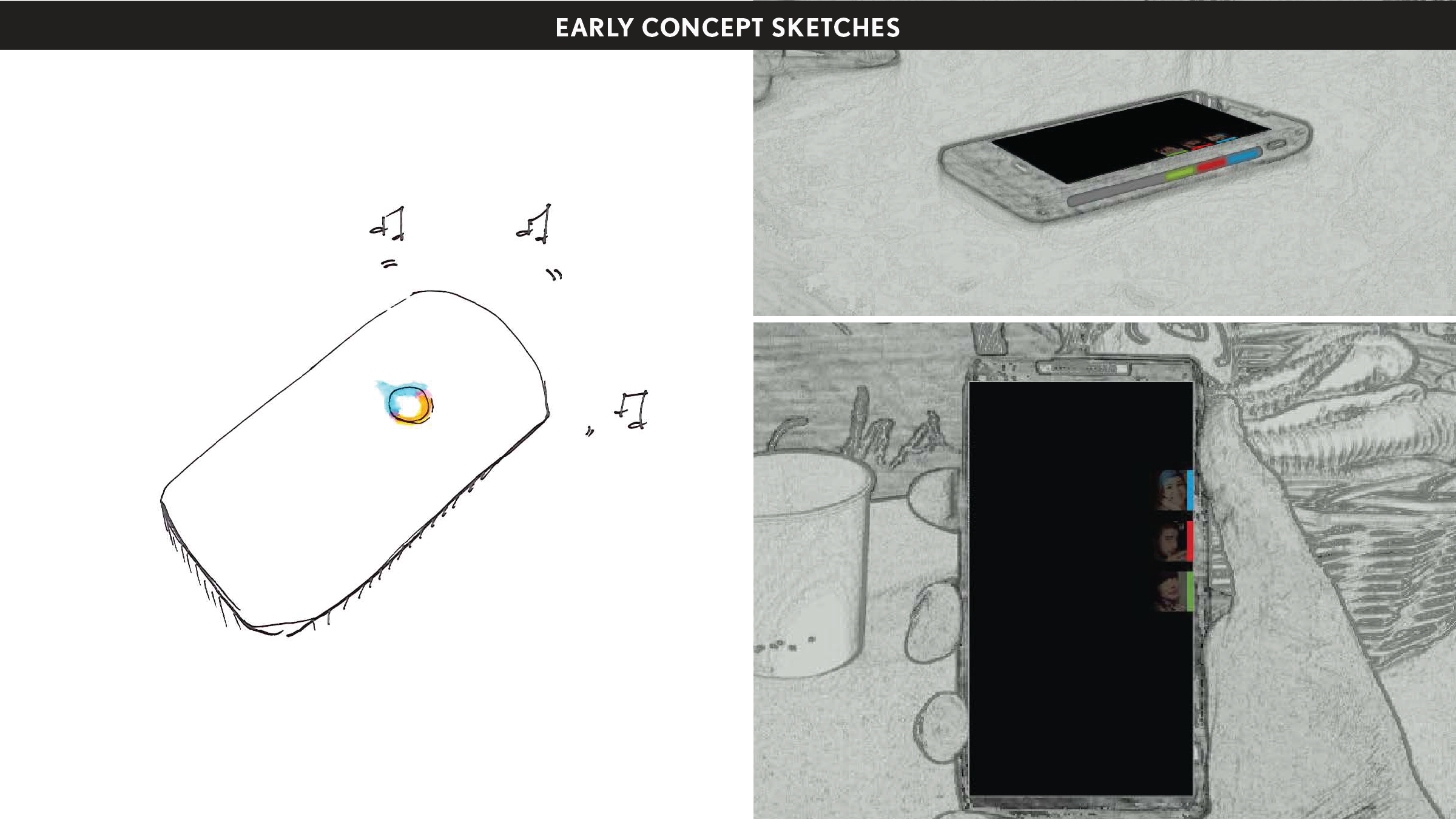
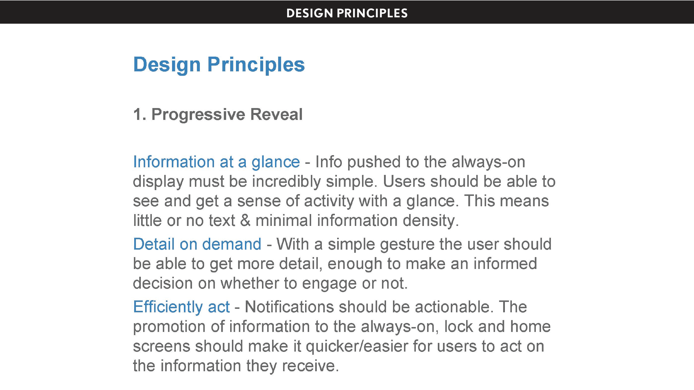
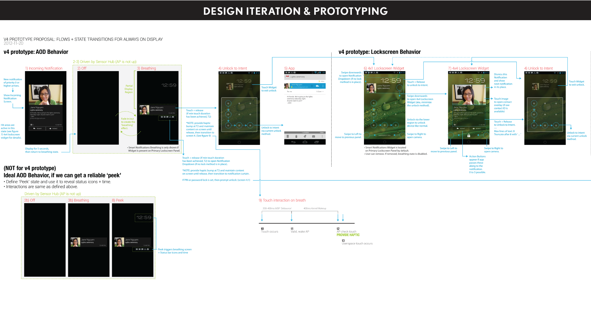
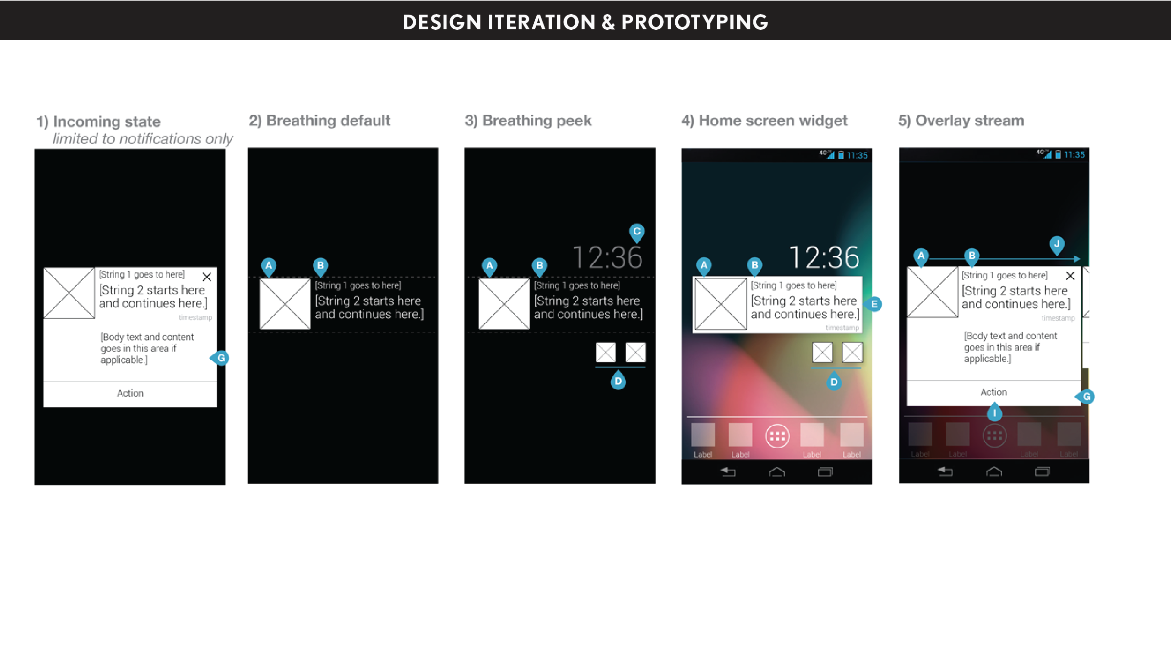
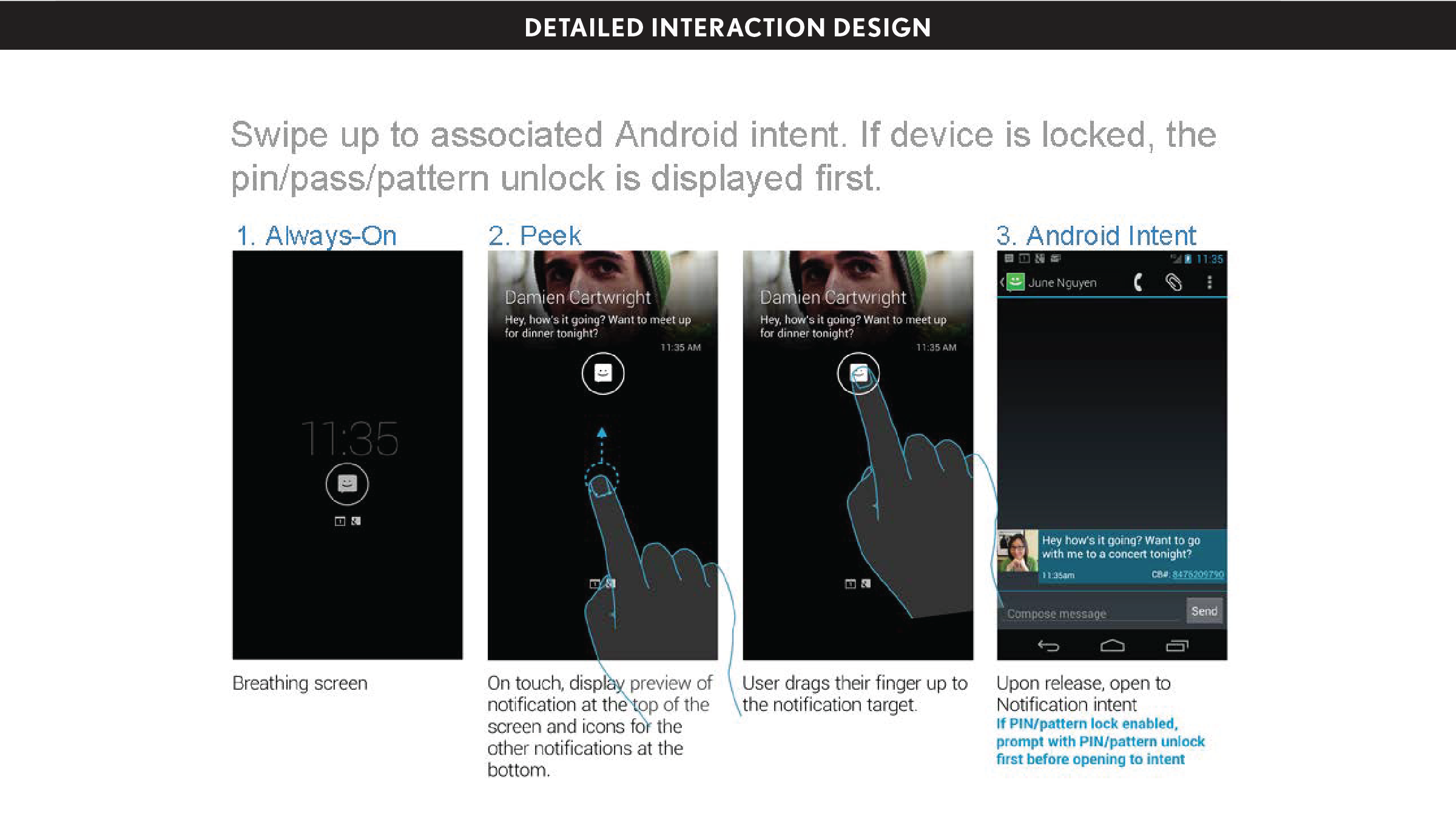
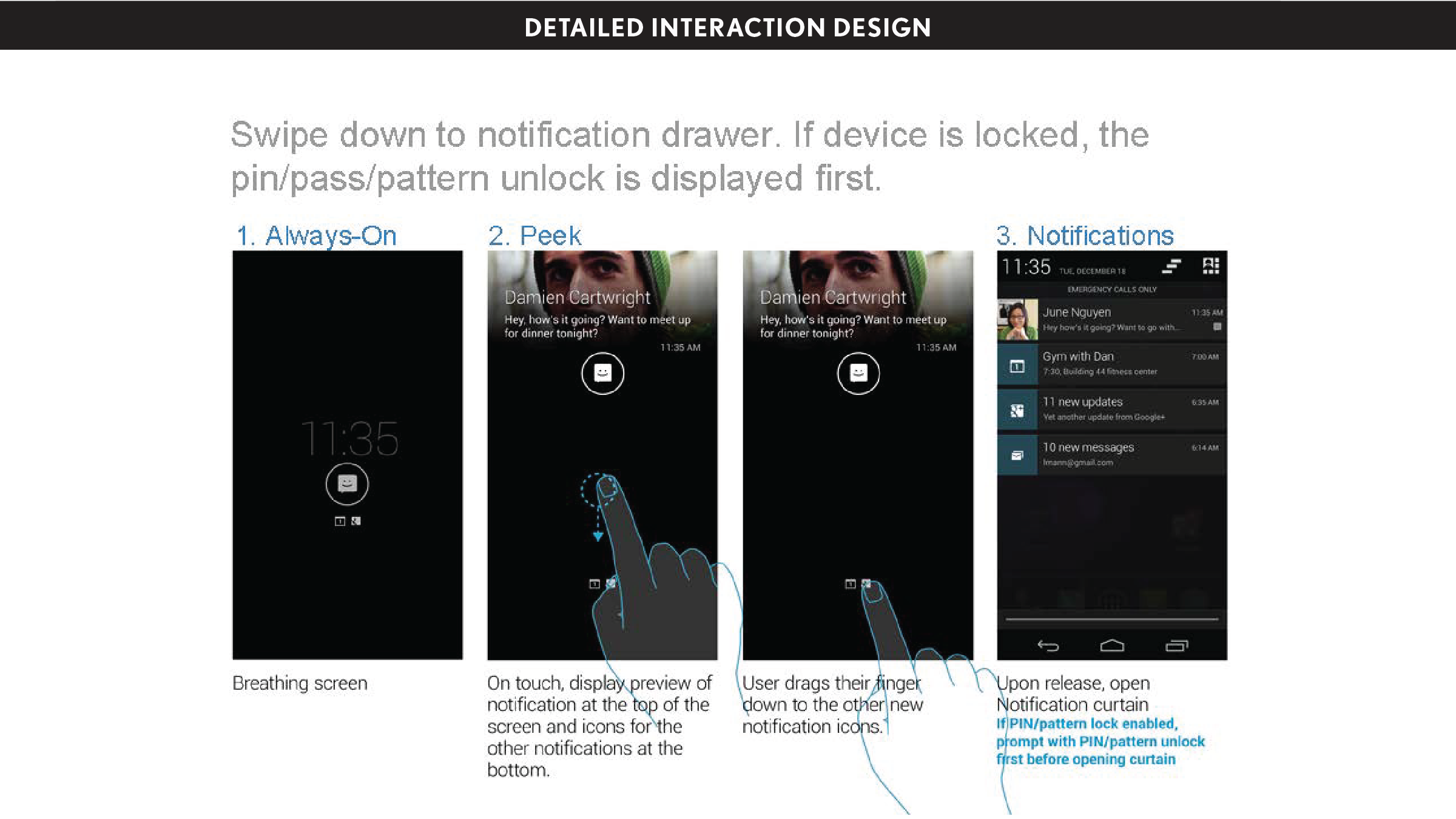
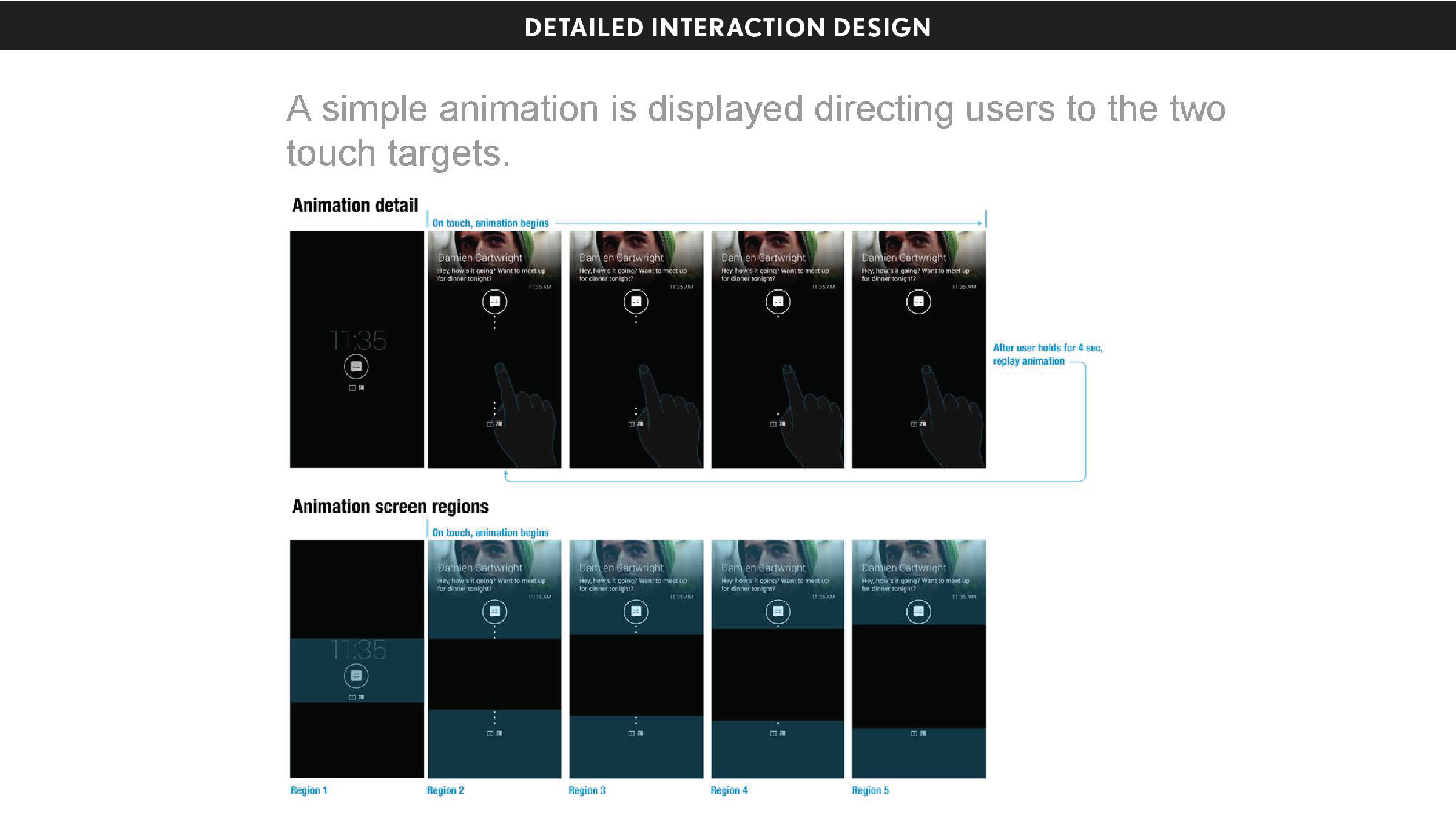
By the time the team created the final design, we had built and tossed out 5 prototypes and designs. When it came to the UI, we explored widgets and card-based streams and more. They were all too much, and defeated our original goal of providing just enough info. After many rounds of building and testing and talking to people, we found that what mattered most to people at a glance was the time and the type of notification. More detail, like who the message was from, was valuable, but should only show itself when the user expressed intent to see more. That's how we developed the "peek" interaction on touch. A whiteboard sketch quickly became a prototype, and we knew we had gotten it right. Details only show when the user interacts, then disappear the instant the user disengages. From there the user can choose to wake their phone—or not.
My role: UX Designer
I was the interaction designer/user experience designer on the team. I worked closely with our UX lead, Jeff DeVries, and our engineering team to define not only the UI and interactions, but the behaviors for the entire system—timing for breathing, how notifications age through the system, what notifications appear, etc. I produced detailed interaction design specifications and rules documents, while also working closely with our Design Research Director, Kristin Arnold, to test multiple concepts, and our Visual Designers, David Gabriel and Danny Jacobs until the experience was pixel-perfect.
Key design contributors: Jeff DeVries (Design Director), David Gabriel (Visual Designer), Danny Jacobs (Visual Designer), Kristin Arnold (Design Research Director), Michael Gunn (Product Engineering), Christian Flowers (Product Engineering)
Process & design artifacts