MOTO UX STRATEGY
Motorola launched the original Moto X with 4 key features: Touchless Control, Active Display, Assist, and Quick Capture. In 2014, they come together under one unified app—Moto.
Photo credit: Android Central
The experience is the brand
After seeing research from the field and learning how people were using the original Moto X, a small team of designers and researchers got together and envisioned a new approach for positioning Motorola's software experience to make features more understandable, recognizable, and own-able. We pitched the idea of unifying Motorola's differentiated features under one app to key stakeholders, and got buy in to make it happen.
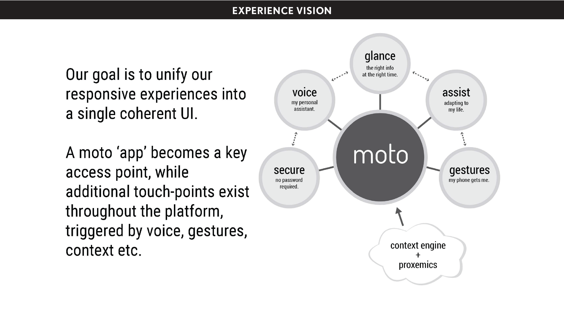
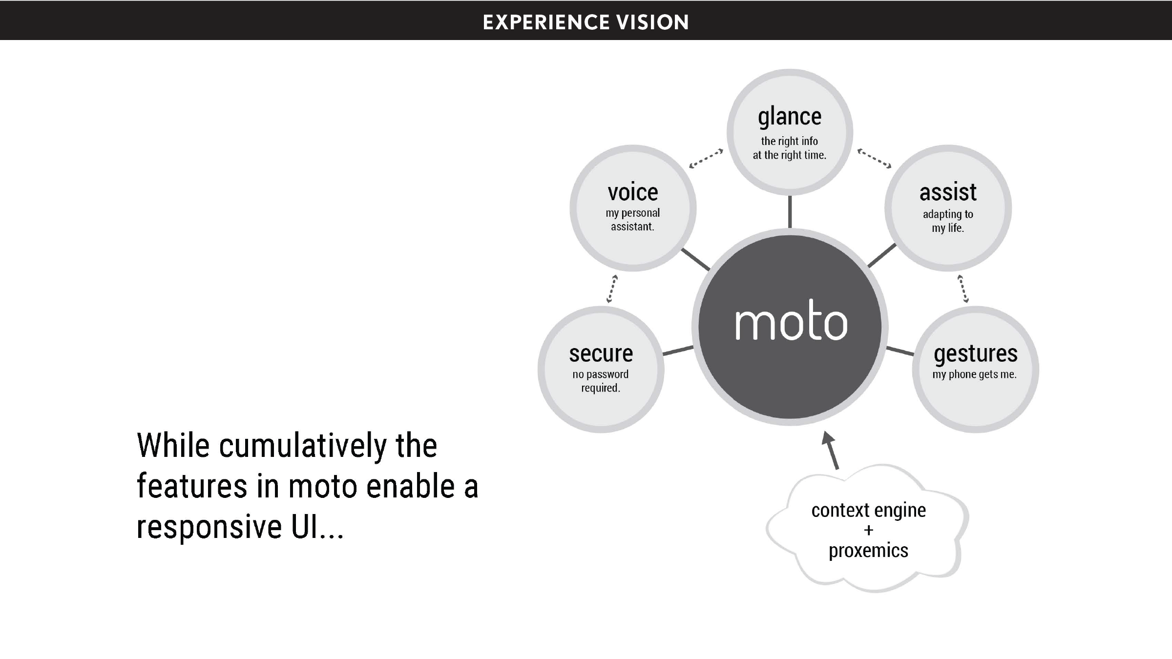
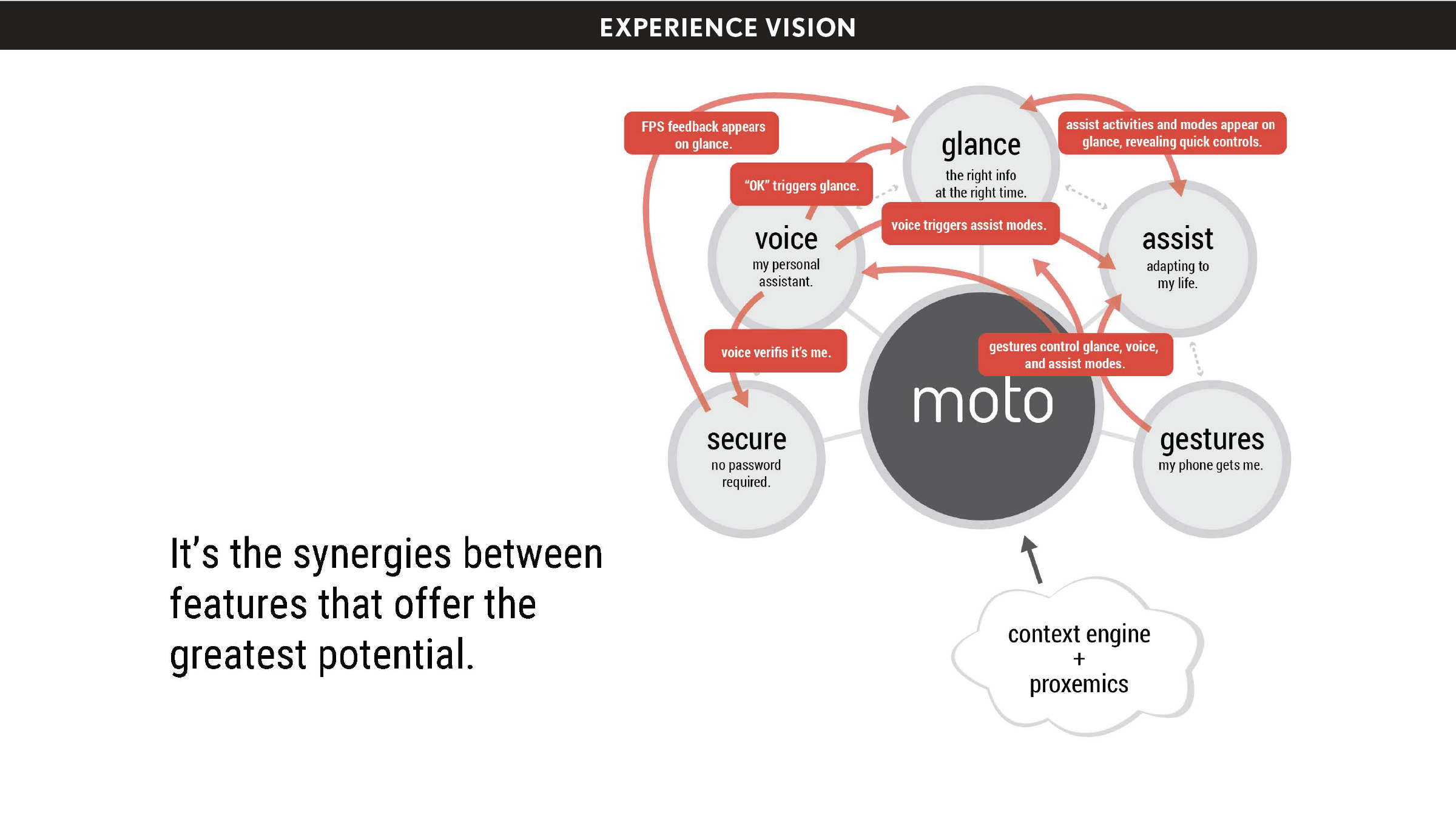
In building the Moto app, we created a gravity around a handful of scattered, valuable features, making them more than the sum of the individual parts, and in so doing elevating the experience of Moto products. We sought to capitalize on what the features had in common—responsiveness—to present the Moto X product as a whole as responsive. We wanted to make it easy for people to see that Moto products had something special, and to point to what that was—the Moto experience.
My role: UX Designer
I worked with the broader team to create the experience story and pitch the concept to leadership and stakeholders. I sketched initial UI concepts, created interactive prototypes, and worked directly with the development team to create the initial proof-of-concept working prototype.
Key design contributors: Jeff DeVries (UX Design Director), Kevin Foy (UX Designer), Kristin Arnold (Design Research Director), Lexi Valasek (Design Researcher), Kat Allen (Content Strategist), Rana Fakhoury (UX Design Director), Adam Miller (UX Designer)
Process & design artifacts